


Flat Design or Material Design- Which One to Prefer?


Since the Google announced Material Design at the 2014 Google I/O conference, there has been an ongoing debate about Material app design and how is it different from Flat app design. Both the design styles are, undoubtedly, popularly used in the industry. One is a spontaneously-adapted design trend, while the other is a purpose-built with a set of guidelines. Both the UI styles are somewhat similar, and this is one of the reasons why people get confused between the two. If you too are facing this situation, get excited as our experienced UI designers are here to clear the clouds of doubts with the shine of their knowledge:
“Before Flat and Material UI Design styles, designers were using Skeuomorphism design style. It was a well-known approach to mobile UI for many years since it helped people to imitate the real world using lighting and shading effects.”
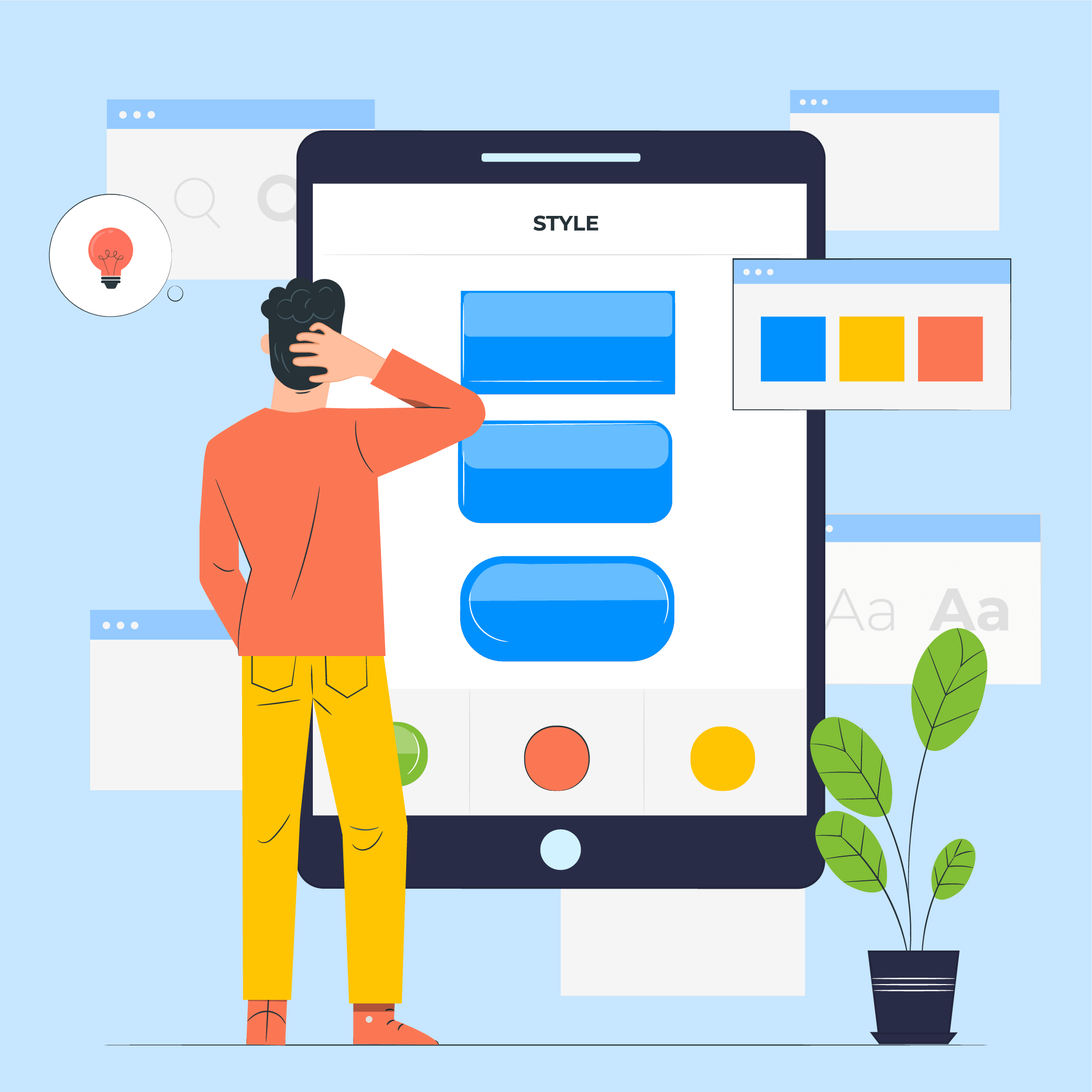
Flat Design
Flat design has been introduced with the motive to provide more aesthetic innovations along with a more user-friendly mobile environment. The flat icons are naive and employ simple images to deliver your message quickly instead of detailed illustrations. These flat images look nice to decorate the webpage as well as allow the users to easily navigate through the page and read the valuable content.
Apple’s Flat design approach is independent of multi-dimensional elements and plays just with fonts, colors, and icons to enhance the beauty of the page. In other words, all the objects seem to be on the same surface in case of this mobile app design style. It is effective to provide elite UI experience to users with both high resolution and low-resolution devices. However, it’s elements appear much smaller due to the absence of shades, gradients and other such elements, which ultimately speed up the page load time.
Also, there are some mobile applications that demand complicated visual cues to guide the user through the process, which is one of the pain points of implementing the flat design style.
“The lack of drop shadow and raised edges make it tough for the users to differentiate between the clickable button and other static vector graphics, which is a drawback of Flat design”, says the top-rated mobile app design company.
{Also read out detailed article on Android vs iOS app design comparison}
Material Design
As it was quite a daunting task to find which element is clickable and which is not in case of Flat design style, the Material design was introduced. The Google’s material app design approach looks flat, but stays multi-dimensional, thanks to the application of z-axis. It has incorporated various skeuomorphism elements to revamp the simplified Flat design.
If you ask us, it won’t be wrong to say that Material design is an improved version of Flat design with the main focus on minor details in terms of shades, layers, and animations.
“Unlike Flat design approach, the Material style comes with a fine-detailed and set of guidelines. Because of this, you need not do much guesswork; you can easily know what you can do and what you cannot do with this UI design style.”
According to the reputed app development companies, if you are looking forward to building apps for multiple platforms, the material approach will empower you to provide a uniform experience across all the devices. This will enhance the user-friendliness and help in branding.
Factors to Choose Between Flat and Material Design
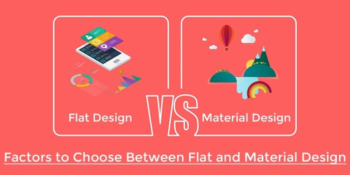
As now you know the basic of both the mobile app design styles, let’s move on to the factors that will help you to choose the right one. When it comes to choosing between the two, the basic factors that come into play are depth, animation, clarity, and navigation.
- Depth
The manner in which the objects move in space and interact with one another merely depends on light, surface, and movement. When it comes to these two design approaches, the Apple’s flat design works with an opinion that mobile devices are a window into another world, encapsulating infinite depth in their apps. Whereas, the Google’s Material design works with the belief that the user should get the feel as if they are carrying the screen on their palms. Thus, the components must be like they were stacked over each other.
- Animation, Shadow, and Pattern
Google recognizes animation as a way to give life to the components and complement the user experience. Thus, the material UI design style utilizes different types of animations to express the type of material you can interact with. According to our UI experts, the animations look like you are arranging cards on a piece of paper. If you want to refresh the page, it would bounce back. This is the basic concept of material app design.
Apple, on the other hand, believes that animations should be such that it drives the users to the right destination without getting distracted.
“Google tends to lean on human side whereas Apple gravitates to lean on inorganic search.”
- Clarity
Apple’s flat design boost the gradients and blurred design, whereas Google’s material focuses on dropping shadows. No matter which product design solutions you go, at the end you will be replicating the real life in one or the other way. Just keep in mind, the center principle is to achieve perfect results while maintaining simplicity.
- Navigation
Google has a few navigation rules according to which a wide range of action buttons and components can be used for navigation. On the opposite side, Apple uses a different navigation system that is easy to understand use. As per Apple’s criteria, if you have a mobile app with less than 5 functions, you have to ponder on the features of the application.
Related Blog:- Importance of UI/UX Design During Your Mobile App Development
Wrapping Up
Both the design styles are prevalent in the market; It’s up to you which one you prefer. If you want to design a simple app with a higher emphasis on user-friendliness over form, flat design is the right option for you. While, if you want to build an enticing app with animations or motion graphics, material design in the best choice. In fact, you can even combine the two approaches to add a WOW factor to your application.
What do you say? Which one is better? Feel free to leave your comments below!

- In just 2 mins you will get a response
- Your idea is 100% protected by our Non Disclosure Agreement.
11 Principles of UX Design From A Startup Perspective
When we hear the word design, we think of creativity or some creative role, in which an individual crafts and designs something beautiful. But, there is a thing with UX design that makes us understand that only aesthetically good designs won’t make for a usable interface. A good user designer makes great user research. When…
Intuitive Search Specs that Separate the Best from the Rest
Sometimes you hear people utter the phrase “I had an intuition” at which point you may wonder whether he/she has the ability to view the future. But that isn’t the case. Intuition is the feeling people derive based on instinct and this instinct isn’t based on conscious reasoning. This subliminal, cerebral concept holds immense significance…
15 Steps to Mobile App Redesign for Market Domination
App redesign is no joke. If you run a mobile-powered business then you are virtually on life-support while indulging in a UI UX overhaul. And if you do not realize that already, then there is all the more need for someone to point you in the right direction. We assume you want a word by…