


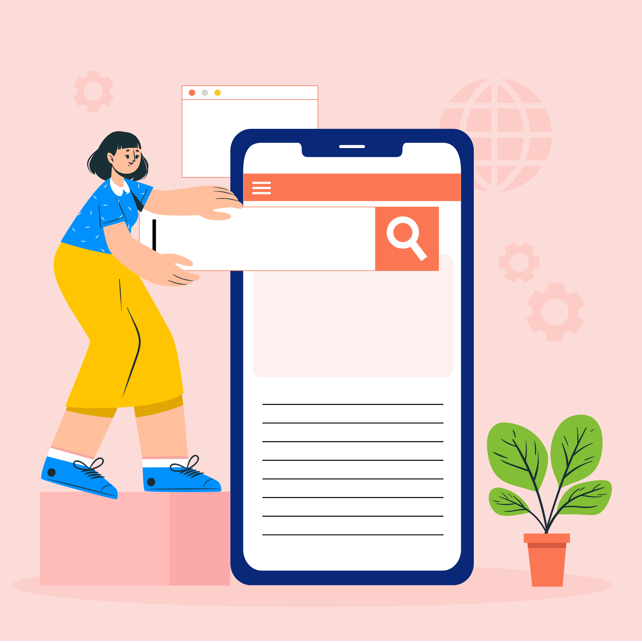
Mobile Responsive Designs for eCommerce Business : Everything You Should Know

- What is Mobile Responsive Web Design for eCommerce Businesses?
- What does it mean for eCommerce websites?
- Responsive vs Adaptive Design: What’s Better For Your eCommerce Website?
- Benefits of Designing a Mobile First eCommerce Website
- How to Deliver Bespoke User Experience Through Your eCommerce Site?
- Mobile Responsive eCommerce Web Design Trends for 2023 and Beyond
- How Can Appinventiv Help You With eCommerce Website Design and Development?

The number of mobile subscriptions have surpassed 6 billion this quarter of 2022 and is further expected to grow by several hundred million within the next quarters. These figures are expected to grow at 1.9% per annum, which states that every other consumer chooses to shop using mobile websites and apps. This is exactly why your eCommerce site needs to be “mobile responsive”.
[You might also want to consider exploring 10 eCommerce website and app features for startups and enterprises. ]
Gartner suggests that eCommerce businesses that are striving for long term success must prioritize the mobile experience. Why?
Because your audience wants to navigate your website intuitively, regardless of their devices. Stating that mobile is the fastest growing channel and users expect to have the same intuitive and seamless purchase experience using their mobile devices, it’s essential for your business to have mobile responsive eCommerce website design.
As a matter of fact, among various factors, not having a responsive design is rated as a top reason why visitors leave an eCommerce website.

Now, you are surrounded with certain questions,
- How powerful is the impact of mobile responsive design in eCommerce?
- Why is the “mobile first” approach important for my business?
- How should my eCommerce website adapt to a more responsive design?
To answer all of these questions, we are going to discuss everything that revolves around your eCommerce website and mobile responsive designs.
Before we start, you must also take a look at an insider’s guide to mobile app and website design
What is Mobile Responsive Web Design for eCommerce Businesses?
Mobile responsive or “mobile first” design is an approach to website design and development that is based on a simple premise which is, initially developing digital products and services for mobile screens and then adapting them for the desktop. An emphasis on mobile user design interfaces creates a superior experience for users which is primarily beneficial for eCommerce businesses.
“The mobile first philosophy provides a clear vision of the core elements in your website”
The mobile responsive design concept has been around for more than a decade, brought into the spotlight by Eric Schmidt, the former CEO of Google in 2010.

What does it mean for eCommerce websites?
With mobile responsive design, you don’t have to manage multiple websites for your eCommerce business. You can simply have one website with the content that you can showcase in various ways using responsive designs.
Responsive design in eCommerce makes your website look flexible enough that every design adjusts to the user’s screen size. A responsive eCommerce website directly impacts the boost of traffic and sales and helps you with refined portfolio, right target audience and website speed.
Now, wouldn’t it be better, if you could compare your current adaptive eCommerce website design with mobile responsive design? Let’s see how they are different.
Responsive vs Adaptive Design: What’s Better For Your eCommerce Website?
Both responsive and adaptive web design are based on the concept of making mobile-friendly eCommerce websites, however, they follow two completely different approaches when it comes to website design and development.

Here is the major difference between adaptive and responsive design:
| Responsive website design | Adaptive website design |
|---|---|
| Website created with responsive design serves the same site to every device changing its layout based on the size and orientation of your user’s device | With adaptive website design, you need a different website layout for every device screen |
| Responsive design takes less work for UX designers to create, where they only have to ensure the layout for possible screens | Adaptive design requires up to six different versions of a single website for different-sized screens which is a lot of work for designers |
| This design approach works best for large scale eCommerce sites that are designed from scratch | This design approach suits smaller eCommerce sites that are being refreshed |
As per top UI/UX trend experts, adaptive web design allows more control and loads faster but is a complex approach since it asks to maintain separate CSS and HTML code for every layout. On the other hand, mobile responsive web design is ideal for new and established eCommerce businesses since it is budget friendly, takes less time to implement and offers a variety of templates.
Now that you know the difference between adaptive and mobile responsive design, it is time we hop on to the benefits you get with responsive design in eCommerce.
Benefits of Designing a Mobile First eCommerce Website
“Mobile user experience accounts for more than 54% of all eCommerce sales.”
eCommerce websites are retooled for mobile, typically converting more browsing shoppers into an active user. Companies and brands know that poor mobile optimization may damage the company’s brand image. While viewing your eCommerce website, if a user faces the challenge of navigating poorly designed and heavily clumsily adapted sites, your business branding might suffer.
[You might also want to look at 7 UI/UX pitfalls to avoid while designing your eCommerce site]
To avoid such circumstances, it’s essential to have a mobile responsive eCommerce platform for your business.
[Also Read: How Much Does it Cost to Build a Marketplace App Like Amazon?]

Here are the most salient benefits of adapting to mobile responsive design for your eCommerce website:
1. Accommodates user web preferences
Most users never let their mobile devices out of sight. Keeping this in mind, handheld devices are more convenient for online shopping, discovering new products and services.
By adopting mobile responsive eCommerce philosophy, your business can reach customers wherever they are. You can offer and make your services more accessible by providing an excellent user experience. Not to mention that this directly results in ranking higher in organic search results.
2. Prioritizes customers
The mobile responsive eCommerce website design philosophy is customer centric. It aims on a flawless customer journey which means website responsive design affects customer loyalty and turning visitors into brand advocates.
Since customer demands and expectations increase every single day, your mobile responsive eCommerce website may also help in staying competitive and bold in the industry. Another benefit is customization that users get via responsive design layouts.
For instance, Appinventiv redefined the online shopping experience for 6th Street, UAE’s leading online fashion platform that provides customers the experience of shopping from the comfort of their homes.
By revamping the design modules to enhance responsive user experience, Appinventiv helped the brand gain 3+ million downloads on iOS and 1+ million downloads on Android.
3. Improves SEO
Responsive web design helps eCommerce businesses increase search engine visibility which means your website is more likely to be visible in search results. Google recommends responsive web designed websites and ranks them higher. Responsive eCommerce websites also allow Google crawl faster using fewer websites.
4. Lower bounce rate
Adapting to a responsive web design eCommerce site results in lower bounce rates and higher conversion rates. Bounce rates analyze the percentage of customers landing on your site and then leaving after viewing the home page. The responsive design layout offers improved UI, focuses on the look and design and automatically focuses on icons flexible with the user screens. With improved UI and design that automatically adjusts to different screen sizes, responsive web design services in Austin can help businesses capture and retain the attention of their online audience.
5. Adapts to future devices and social media
Responsive web designed eCommerce sites have fluid layouts that help modify the size of the templates to adapt every screen size perfectly making website display flawless on every future device.
Not to forget that responsive designs also render the content and pages on all user devices by modifying the screen. With responsive and attentive layout and icons, it is also easier for customers to share your products and content on media, leading to a wider range of audience. You can also embed social media feeds to keep your audience engaged in real-time.
Apart from these vital benefits of responsive design in eCommerce, your site might also process and load faster with adjusting traffic.

Now, if you are convinced to get started to develop or refresh your eCommerce website with a mobile responsive design approach, here’s how you can deliver a bespoke user experience to your customers.
How to Deliver Bespoke User Experience Through Your eCommerce Site?
So, you have developed a great mobile website, what next you need to do?
By offering human-centric responsive designs and kink-free coding, you can meet your business objectives and earn value and revenue, both. Here are a few guidelines that we follow in all the eCommerce mobile optimization designs:
1. Start with a simple design
The objective of an eCommerce business implementing responsive design for its eCommerce store should revolve around a simplified user experience – one that notes the transition from a laptop or tablet to a palm-sized device.
Experts recommend starting with the creation of a wireframe. In the wireframing process, we ensure that all the information customers are more likely to interact with is right ahead of them on screen.
2. Take care of resolution
The mantra of a good responsive website and app design is to have your app fit the size of the device your customers are on. There can be nothing more irritating for an important eCommerce industry stakeholder to scroll endlessly and miss out on important information because of the small screen size.
3. Give users the choice to switch to your original website
An assumption that every eCommerce app development cost estimate considers is believing that the users working on large devices would want to switch to the original version of the store. Considering that, it is important to show them the location of the button from where they can change the screen size.
4. Make use of mobile commerce plug-ins
Although the responsibility of adding the right plug-in falls upon your partnered eCommerce mobile app development company, it doesn’t help to have the information. A number of eCommerce software providers offer add-on products for making mobile stores more efficient.
5. Test your app design
Irrespective of how much time you spend in making a responsive eCommerce design, it would all go to waste if you don’t test the versions enough. Although there are multiple software available for the purpose like – PerfectoMobile, DeviceAnywhere, and device emulators, it is suggested to manually test your responsive and adaptive design on devices and see the result.

While there are certain breakpoints for eCommerce responsive designing, you are all good-to-go if you follow the above mentioned points for your eCommerce site design.
Now that we are done with understanding how revolutionizing responsive design approach can be for any eCommerce business, you must definitely not miss out the eCommerce design trends in upcoming years.
Mobile Responsive eCommerce Web Design Trends for 2023 and Beyond
While eCommerce businesses initially started creating responsive designs that fit varying screens sizes, it soon became apparent that various trends don’t work on narrow mobile screen devices. eCommerce and mCommerce industry trends come and go every minute, but what trends are here to stay, let’s take a look.
1. Vector graphics
Vector for a website is one of the biggest web design trends used by several eCommerce giants. These graphics are super popular and offer a level of dimension and can be a great addition to your eCommerce site design.
Moreover, vector graphics help in keeping the images clear and bold in all screen sizes.
2. Dark Mode
Over the past few years, one trend that never left the list is the Dark mode. Since the audience drools over the dark mode options, many designers believe it’s easier on the eye and better for enhanced battery life.
3. Single scrolling page
One page eCommerce websites make the user experience effective and simple where all the content is on the same page. Adding a smooth single long scrolling page helps your eCommerce site appear more professional and user friendly.
Moreover, having all the control on a single page rather than navigating through multiple pages, help with attention and engagement
4. Minimalist design
The trend that cannot be stretched enough is minimally designed eCommerce sites that are just not fashionable but practical. The primary goal of a responsive eCommerce site is to design a site that is simple and easy to navigate.
Reducing clutter and noise from your site attracts more visitors and engagement with content that is visually appealing.
You must also take a look at Appinventiv’s best designed mobile apps and sites for reference.
eCommerce website and app development has become “The Need Of The Hour” for every e-commerce business and brand. Being an entrepreneur or a business owner, you are required to plant your flag on the summit, and you need more than a responsive eCommerce site.
How Can Appinventiv Help You With eCommerce Website Design and Development?
The key strategy that needs to be considered in building an effective responsive eCommerce site is: imbibe the comprehensive mobile responsive design to deliver the top-notch user-experience to the audiences of mobile users.
Appinventiv is a leading Ecommerce application development company that develops websites and apps with 80% lower cart abandonment rate. Appinventiv has designed some of the renowned global eCommerce apps such as Pizza Hut, Dominos, Adidas etc. utilizing every industry vertical. Our eCommerce development services target conversion and retention including:
- eCommerce market analysis and assessment
- Mobile commerce app development
- Migration from eCommerce to mCommerce
- eCommerce app design
- Mobile wallet development and much more
Consult our design experts to get started now!

- In just 2 mins you will get a response
- Your idea is 100% protected by our Non Disclosure Agreement.

11 Principles of UX Design From A Startup Perspective
When we hear the word design, we think of creativity or some creative role, in which an individual crafts and designs something beautiful. But, there is a thing with UX design that makes us understand that only aesthetically good designs won’t make for a usable interface. A good user designer makes great user research. When…
Intuitive Search Specs that Separate the Best from the Rest
Sometimes you hear people utter the phrase “I had an intuition” at which point you may wonder whether he/she has the ability to view the future. But that isn’t the case. Intuition is the feeling people derive based on instinct and this instinct isn’t based on conscious reasoning. This subliminal, cerebral concept holds immense significance…

15 Steps to Mobile App Redesign for Market Domination
App redesign is no joke. If you run a mobile-powered business then you are virtually on life-support while indulging in a UI UX overhaul. And if you do not realize that already, then there is all the more need for someone to point you in the right direction. We assume you want a word by…


