


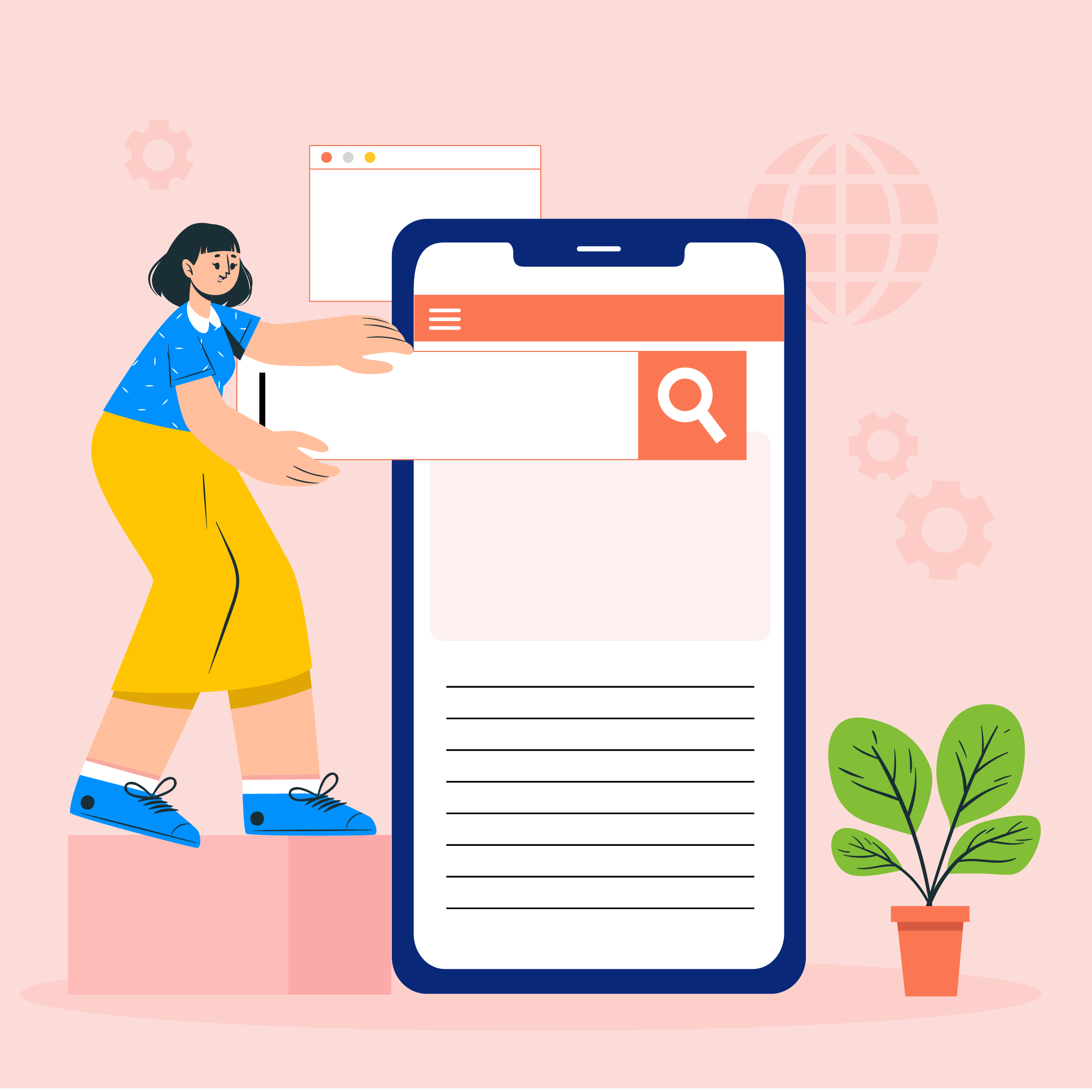


How to Convert Website Visitors into Loyal Customers?


In the next 5 minutes, you will gather all the knowledge about repulsing potential customers with the help of your website. But if you continue reading after that, we will let you in the secrets of how not to do that.
Every smart marketer knows what kind of impact a good website can have on a business’s conversion rates – A Big One. And this magic wand becomes an even more crucial key to conversions for startups and small businesses.
There are two major kinds of mistakes that can sum up a Bad website – Design mistakes and Usability mistakes.
Well, the good news is, mistakes can be corrected. However, if you’re one of those businesses who have altogether skipped bringing your business on a website, then it is just bad news for you.
Without procrastinating a day more, you should start working on building a website for your business but before that, read on, to find out the dos and don’ts of business websites and how they make you money.
Mistakes Made in Creating A Website

What is the most basic function of a website? Delighting the visitors
What is that the website should not do? Annoy the Visitors.
It is that simple. But only for a more elaborate discussion, let us take into account that what are the mistakes made by developers and designers in creating a website that might end up annoying visitors, aka Potential customers, instead of helping them.
A. Purposeless Pagination
Pagination is the process of splitting up the contents of a web page into multiple pages because displaying too many articles and images on a single page make it bulky and hard to load. It is often done for web pages with a long list of articles or items and it makes sense.
Although, there is another reason for which the process of Pagination is being used for a purpose which is plain annoying for users. Some websites divide a single article into multiple pages in order to increase page views. More than a few websites and blogs earn their revenues with the help of advertising and getting page views.
While this may look like an easy way to earn extra bucks but besides being irksome for users, it also poses a serious problem. That is, search engines analyse the content of each of your website pages and indexes these pages according to the content of those pages along with keywords. If each page is divided into multiple pages, it dilutes the content and thus it will negatively affect the page ranking of your website.
B. Broken Links
One of the most annoying things on any website is seeing the “404” error pages. These are the hyperlinks that lead nowhere. For the best way to avoid these best links, you need to thoroughly test your website as regularly as possible. For a little help, you can even include a “contact the webmaster” link at the end of your web pages so that if a user finds a broken link, they can quickly inform you and they can be fixed immediately.
C.Having Multiple Font Styles
Any web page or all the web pages of a single website need to have a uniformity in terms of style, colour theme and typography. This helps the website in having an acquired consistency but what most novice website developers do not understand is that using multiple font styles does not add to the site aesthetics, instead, they make it look like a mash-up of an immature website.
Your website should be able to ensure the visitors of your stability, maturity and reliability and not otherwise. It is also important to test your aesthetics over a number of devices and learn how to create a high conversion website.
D. Bad Navigation
A website should allow the users to seamlessly navigate through the website without the need to ask another person about the whereabouts of any particular section. Users must be able to find their way around as easily as possible and not struggle to find a certain information on the website.
For getting over a bad navigation, textual descriptions can be used for all the links. Always remember that users are impatient for any new website and if they cannot find their way around in 3 clicks or less, they will leave immediately.
E. Complicated Registration Process
Registration pages are a tricky business. Many a time, websites ask for information that they do not need and it becomes a hassle for the users to fill in the entire form and not to mention if they mistakenly reload the page and then are asked to fill in the whole information again. This is a recipe for driving users away at first glance. Gone are the days when users used to fill out a long form for every registration process.
SO even though you make your registration process mandatory, you need to do a research on the form details and choose the mandatory details only. After all, for signing up for a newsletter, users do not need to fill their Father’s name.
After going through the major mistakes most website designers end up making, we ought to learn about the corrections of these mistakes which do nothing other than driving the users away. Therefore, let us take a look at how to convert website visitors into customers.
Ways to Make Your Website A Conversion Magnet

In order to build a conversion focused web design, there are certain things to take care of and not to let the big mistakes of website design come into your way to convert traffic into sales. In fact, let us move forward and see how to make your website a customer generating machine.
In order to attract more traffic in a way that they’ll be interested in doing business with you and your company, you need to take care of the following things with the utmost importance.
1. Work Upon the Readability
There are very simple ways to enhance user experience with the readability of your website. It can be done in two ways:
Always compare your website’s colour schemes with that of other websites of the same business domain as yours. You can use Semrush or alternative tools to analyze competitors’ websites for design benchmarks, readability factors, and audience engagement insights.
Use a more readable and clear font for your website typography. The best to use is Sans serif typeface since it allows easy reading on the web.
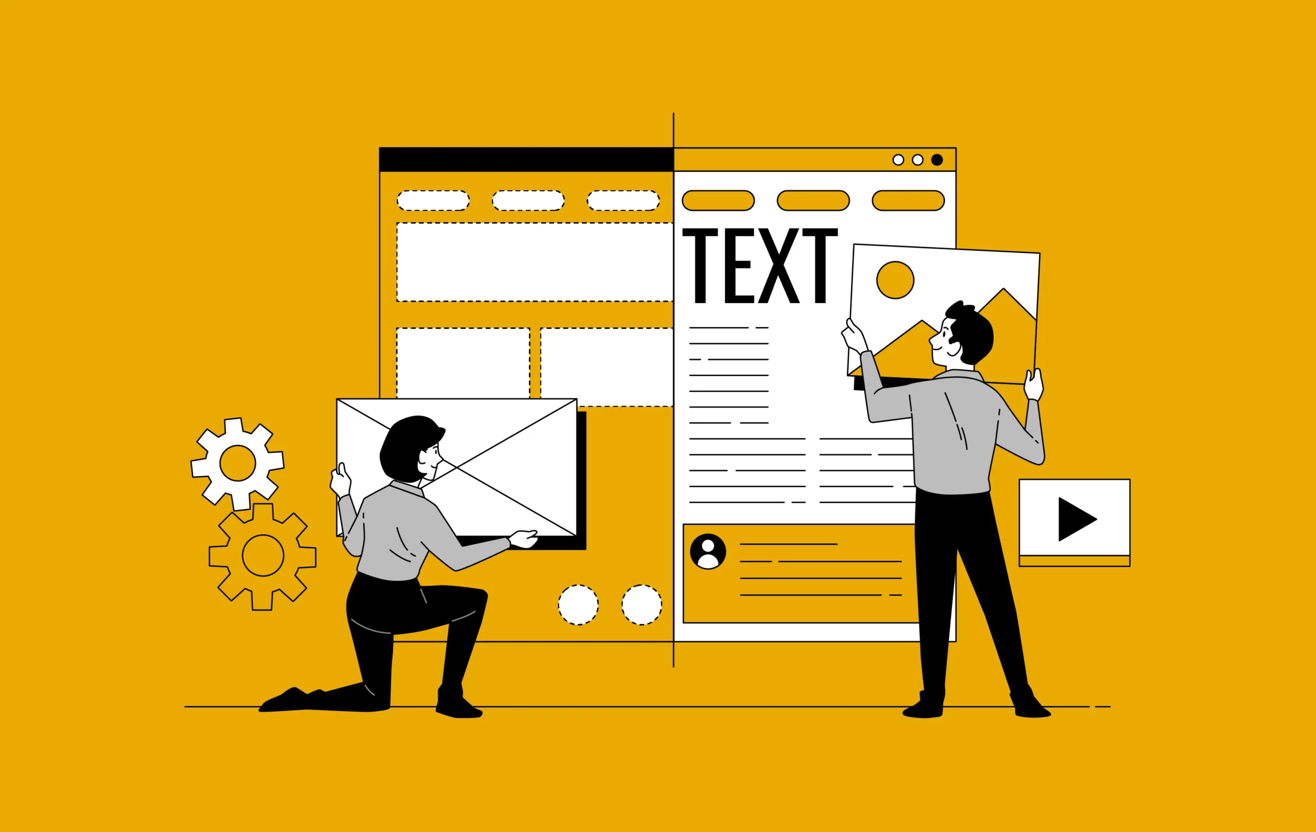
2. Work Upon an Organized Content Layout
Let’s face it – any website’s content is the driving force of traffic. Therefore to increase website conversions, paying extra attention to the content is what is required of the website developer and designer. It is highly crucial to know that the structure of website content can either make it a success or a failure.
In order to organise content on your website, use HTML and CSS while designing the paged of your website. Apart from that, there should be enough whitespace between the images and text with the use of margins.
Also, it is very important to regularly update your content and website pages. And updating the content does not mean adding more content but rather to find out and correct past mistakes.
You can also look forward to hiring a “web gardener” in your content team who will basically root out old mistakes and keep the web content up to date.
Bonus Read- How Much Does It Cost to Make a Website in 2022
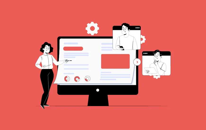
3. Consistency in UI Design
Some new designers take the UI design to the next level and put excessive elements of design without a theme to work with. Sometimes they even go far enough to apply a different theme for every page of the website. It does not matter how wonderful the individual design elements are if the overall consistency of the website is missed, converting the website visitors to leads can turn into an unachievable dream.
For avoiding this inaccuracy, the website designers should use a consistent design template for every one of the web pages along with embedding the links to the main page of the site.
Aesthetically, simple design is the key to creating a conversion focussed web design.
4. Having a User-Friendly Screen Resolution
I can say with certainty that we all have, at some point of the other, visited a website where we had to scroll horizontally or zoom out to get a full look of the page. This happens because the screen resolution is not tested among multiple devices.
A good website designer will always take care of the fact that his/her website should fit the devices and screens of all sizes and resolutions. Unarguably, this is a difficult task to include all the different devices in the design but still, we can use different tools that can help the designers to learn how to optimise your website for more conversions for the majority of the devices.
Services such as Google Analytics can help you in gathering information about the various monitor resolutions of your users and this information can be used in the design update of your website.
5. Careful Usage of Graphics
For a big customer conversion Idea – Never use too many graphics/images/animations on your web pages. Although, it is true that images can gain the user’s attention but it can also work as a distraction from the main content of the website. Instead of stuffing the website with as many images as possible, they should be used at subtle guides for helping the user to understand the content and navigate through the website.
The appropriate use of Graphics and animation is how to boost conversions on your website, so use them wisely.
To sum up, the above-mentioned mistakes and the ways to correct them are not limited to these elements. All the good website designers and developers are aware of the power a website holds over the conversion rate of deals and that’s why, we, at Appinventiv, build a website as an extension of the mobile app for our clients.
There are delicate methods that we apply to the websites that we build to ensure converting website visitors to leads as much as possible.
To know how you can improve your website and get more customers, head on to our Product Design service section to know what we do to make websites a conversion magnet.

- In just 2 mins you will get a response
- Your idea is 100% protected by our Non Disclosure Agreement.

How Much Does it Cost to Build a Web App in Australia?
Key takeaways: The average cost of web app development in Australia ranges from AUD 60,000 to AUD 4500,000 for basic to complex projects. Web app development is growing in Australia, driven by industries like e-commerce, fintech, healthcare, and education. Australia’s tech talent pool is competitive, with an increasing number of developers in cities like Perth…
How Much Does It Cost to Develop a Web App like Hukoomi?
According to a report, out of 8.1 billion of the estimated global population (measured on 14th Sept 2023), approximately 5.18 billion are internet users, meaning over 65% of the world's population uses web apps for various purposes. So, in an era where digital transformation is revolutionizing almost every aspect of the modern business world, the…
Website Development Cost Estimation in 2026: A Closer Analysis
Are you a budding entrepreneur looking forward to kickstarting your digital business or an enterprise looking to enhance its online presence through a well-performing website? If yes, you have landed at the right place. Being one of the most powerful marketing channels, a website can drive higher sales and enhance customer retention. It can further…