App Store is a busy place where you are required to compete with a wide assortment of products of the same category and if you are looking to get more people to download your app from the App Store, then you need to be very careful about its icon. It plays a pivotal role in making your app instantly recognized. In other words, a mobile app icon acts as an invitation because if the icon is good, then it entice users to try your product. It even build the assumptions about its working in the mind of users. It is believed that if the icon looks well crafted, then it gives a sense of assurance to its users that the app will offer equally wonderful experience.
![]()
Few tips that will help your mobile app’s icon stand out among the rest.
Choose Amazing Color
Colors have the power to influence the purchase decisions. When you choose the right color for your icon, then it will help your mobile application stand out both against the background image of the user and also against all those applications that has been installed by the user. While finalizing the color, you can stick to the colors of your company’s logo. In addition, you can follow the trend and opt for a red or blue color, but if you don’t want to be the trend follower then you can opt for a seasonal hue such as bright pink or orange.
Be Unique
In order to stand out from the crowd, there is a need of being ultra creative as well as unique. Hence, you can play with several patterns, compositions and should think outside the box design.
Maintain the consistency
It is very important for you to ensure the consistency between the app as well as icon and in order to provide this, you need to hold the color palette of your interface and there should be consistency in terms of design language as well such as blue and white interface highlighted by the same kind of icon.
Keep It Simple
Complex icons designs not only become meaningless, but also become unnoticeable in the app store. If you over design your app icon, then will definitely catch the attention of customers, but not necessarily for the right reasons. Thus, you are required to keep your design as clean as possible. While designing icon, you should never forget that an easy to remember logo makes a lot easier to remember app.
Maintain the high Quality
The quality of your icon speaks about the quality of your app to potential users. A more polished icon allow your potential customers think that your product is well made and worthwhile.
Scalability
It is important for you to make your icon look great in different sizes. Android and Apple have clear guidelines on the required sizes, which should be considered properly.
Ensure Recognizability in Design
For recognizability, if you are a established brand then use your brand color and logo. On the other hand, for startups, it is good to use obvious elements so as to convey the message.
Don’t mix pictures with words
Using name in your icon gives it a more cluttered look and thus, instead of this you can use the space for a much more enticing thing.
Mobile app icon is a small picture that represents an app in Google Play or App Store. We at AppInventiv Technologies, pays a lot of attention on designing your app icon. You can contact us for more information on your requirements.


- In just 2 mins you will get a response
- Your idea is 100% protected by our Non Disclosure Agreement.
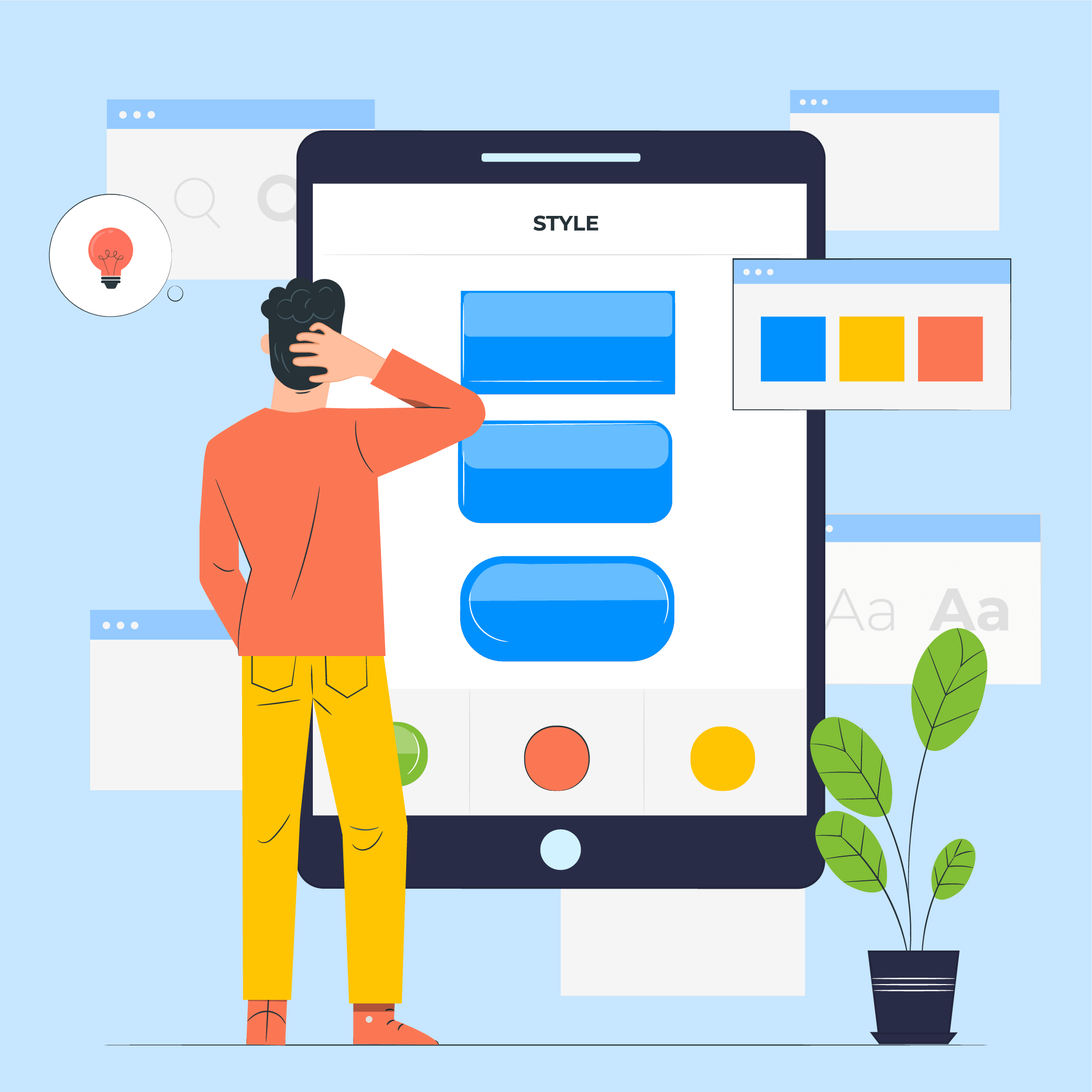
11 Principles of UX Design From A Startup Perspective
When we hear the word design, we think of creativity or some creative role, in which an individual crafts and designs something beautiful. But, there is a thing with UX design that makes us understand that only aesthetically good designs won’t make for a usable interface. A good user designer makes great user research. When…
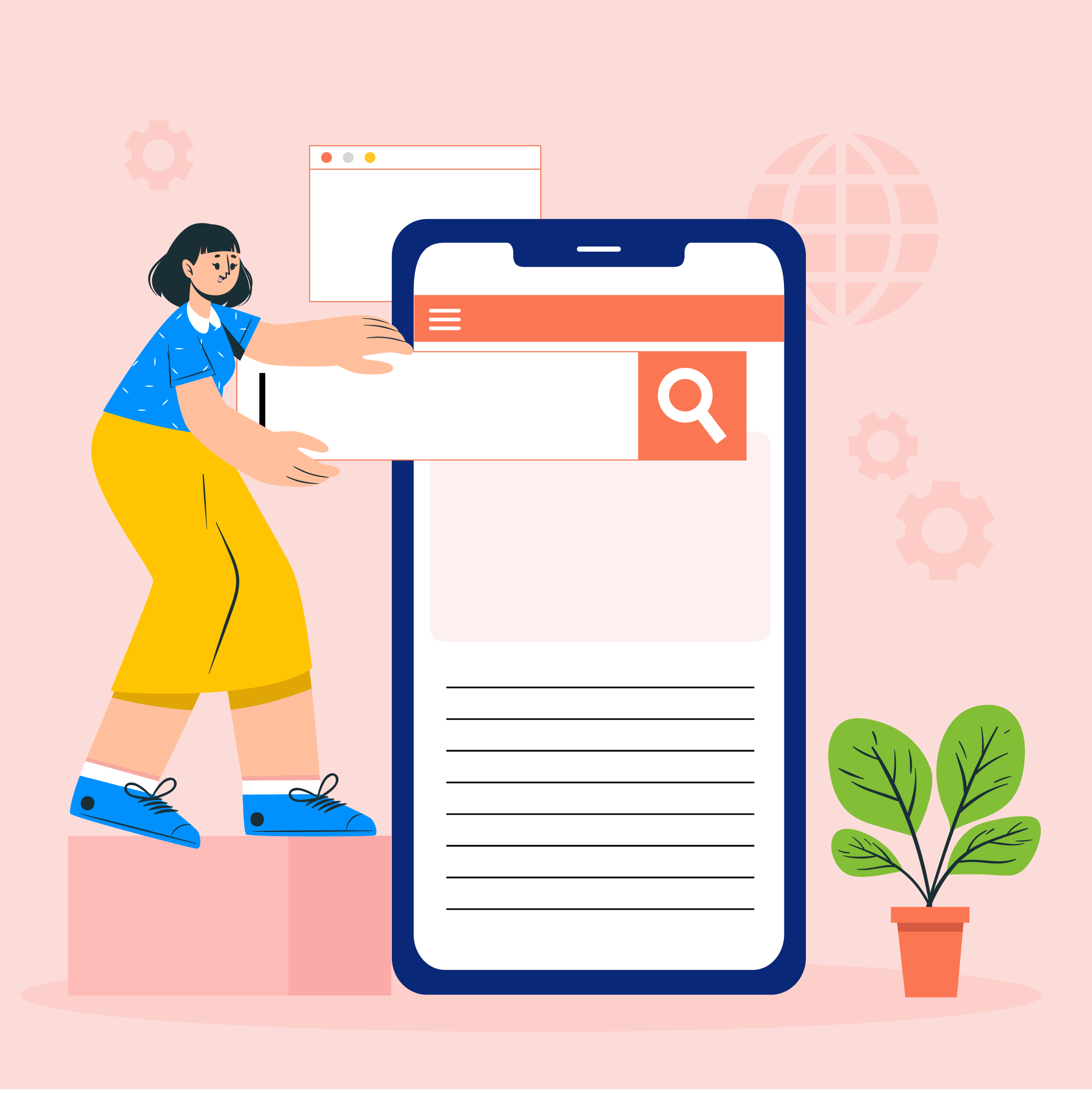
Intuitive Search Specs that Separate the Best from the Rest
Sometimes you hear people utter the phrase “I had an intuition” at which point you may wonder whether he/she has the ability to view the future. But that isn’t the case. Intuition is the feeling people derive based on instinct and this instinct isn’t based on conscious reasoning. This subliminal, cerebral concept holds immense significance…

15 Steps to Mobile App Redesign for Market Domination
App redesign is no joke. If you run a mobile-powered business then you are virtually on life-support while indulging in a UI UX overhaul. And if you do not realize that already, then there is all the more need for someone to point you in the right direction. We assume you want a word by…


