


Google Material Design’s Impact on Mobile App Design [Complete Guide]


In the next eight minutes, you are going to read about how Material Design impact the mobile app design companies around the globe. You will read of the guiding principles that the Google Material Design standards are based upon, and how to incorporate Material Design into your mobile app.
Let’s get on with the Design Journey called Material Design.
UI and UX are the two mobile app elements that decide the present and future of not just the app but also of the mobile app design company that designed and developed it.
All the proven tips to enhance the mobile app UI gets concentrated on one element – Mobile App Design.
The way how your app is designed is what impacts the emotion of experience the users are facing when operating inside your Android app.
The demands of a modern day app user – apps that look the same way as their real-life elements feel – while seemingly easy to understand, can pose a challenge when converted into a design.
Now when it comes to the creation and inclusion of interactive design elements that give the feeling of the material world, Google with its Material Design, gave the Mobile app developers the much-needed aid.
The designing world that was earlier ruled by the minimalistic flatness was now replaced by the elements of minimalistic interactive materials with the introduction of Material Designs.
Now that we understand what is Google material design, let’s now delve into the Google Material Design UI and its tips and tricks
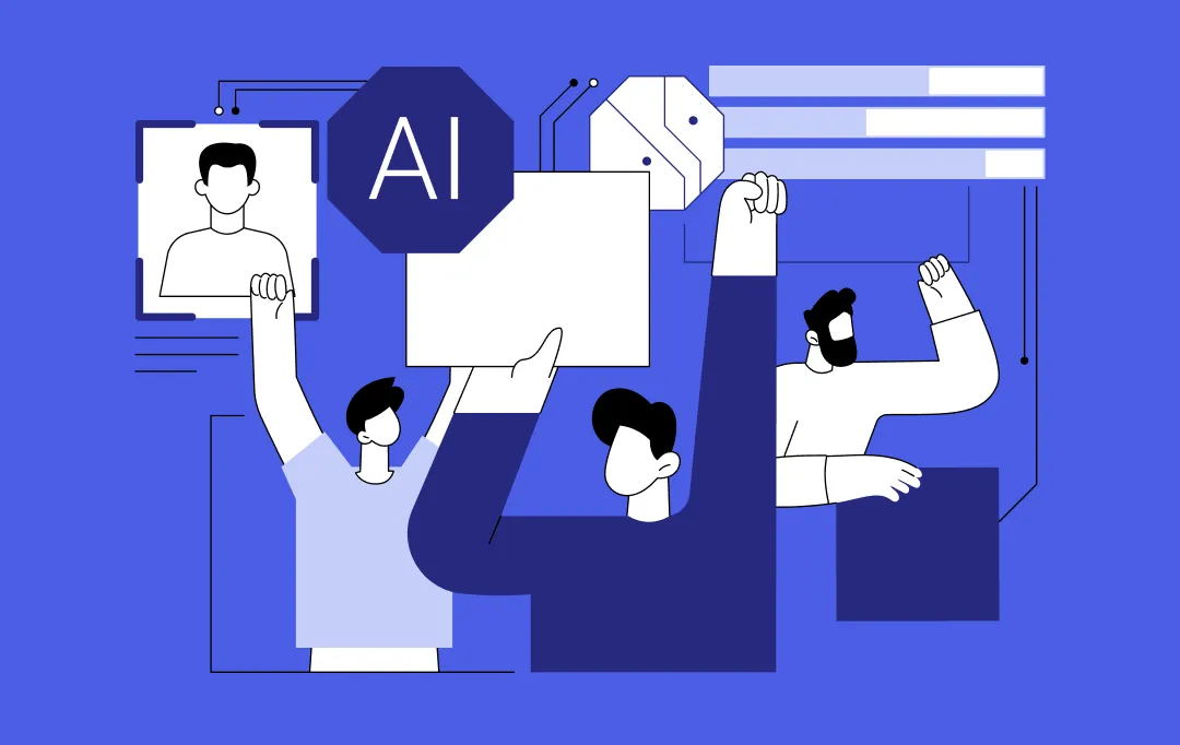
Here are The Principles of Google Material Design

Material Design Apps are guided by the three principles shown in the image above. The principles that are sworn upon by all the leading Android App Design Company around the world.
Material is the Metaphor
The imaginative principle is based upon the study of material and how they look different in the varied amount of light and how they look when piled up one above another.
The principle is backed by attributes like edges, shadows, dimensions, etc.
Bold, Intentional, Graphic

Intentional white space in design, usage of bold and yet in-sync set of colours, and graphics that fit from screen to screen, while serving their direct purpose is what defines the second most pointer in the Google material design principles.
Motion Offers Meaning

Animation in Material Design is one that does not interfere with the other design elements, nor does it look forced. They emerge as the result of the user’s primary actions and follow their cues.
While these are the three main guiding principles of Material Design, there are other two principles as well which define the globally accepted designing standard – Flexible Foundation and Cross Platform.
Flexible Foundation

Material Design comes with the advantage of the custom codebase that allows mobile app UI designers to add their branding elements into the design.
Cross-Platform

Material Design help maintain a similar UI across the different platforms, which help use shared components across all – Android, Flutter, iOS, and Web.
So here were the 5 guiding principles of Material Design for Android Apps. To speed up your approach to understanding these principles, it is time to look into how you can apply them in your mobile app UI design.
How to Master Google Material Design in Your Android App?

Assuming that you would have read the official material design resources released by Google as your Bible, let us get you started with applying those Android material design guideline in your Mobile app.
Below are the tips that would help you build a Google Material Design mobile app and emerge as the designing star of your Mobile app design company by following Android ux guidelines.
1. Use Shadows to Show Hierarchy

Edges, surface, and realistic shadows count as the main tool of Google ui guidelines. Use shadows to show the hierarchy of the design elements to show which element comes on what.
2. Bold Colours

Intentional, Graphic, and Bold is the mantra of implementing Google new material design when it comes to mobile UI/UX development. Usage of bold colours make things interactive and fun for the users, while making the app enjoyable to use.
3. Usage of Primary and Accent Colour

Google Material docs ask mobile app designers to use three shades of the primary colour and one of the accent colour.
The primary set of colours would be used for fonts, boxes, and backgrounds etc, while the accent colour can be filled in to show the main element of your mobile app screen.
4. Extract Colours from the Images
Google constantly encourages us mobile app designers to extract the colour from the images and use them as your colour palette when you are developing an image based design.
5. Incorporate Motion

Google goes big on the use of motion in an app UI design. It makes us understand how things move in the app and how the users should interact with the app.
6. Make Everything Float

If there is one visible Material Design App USP, it is the floating design elements. Your app’s button or the CTA bar should appear as if they are floating on the screen and not lying there flat on the screen.
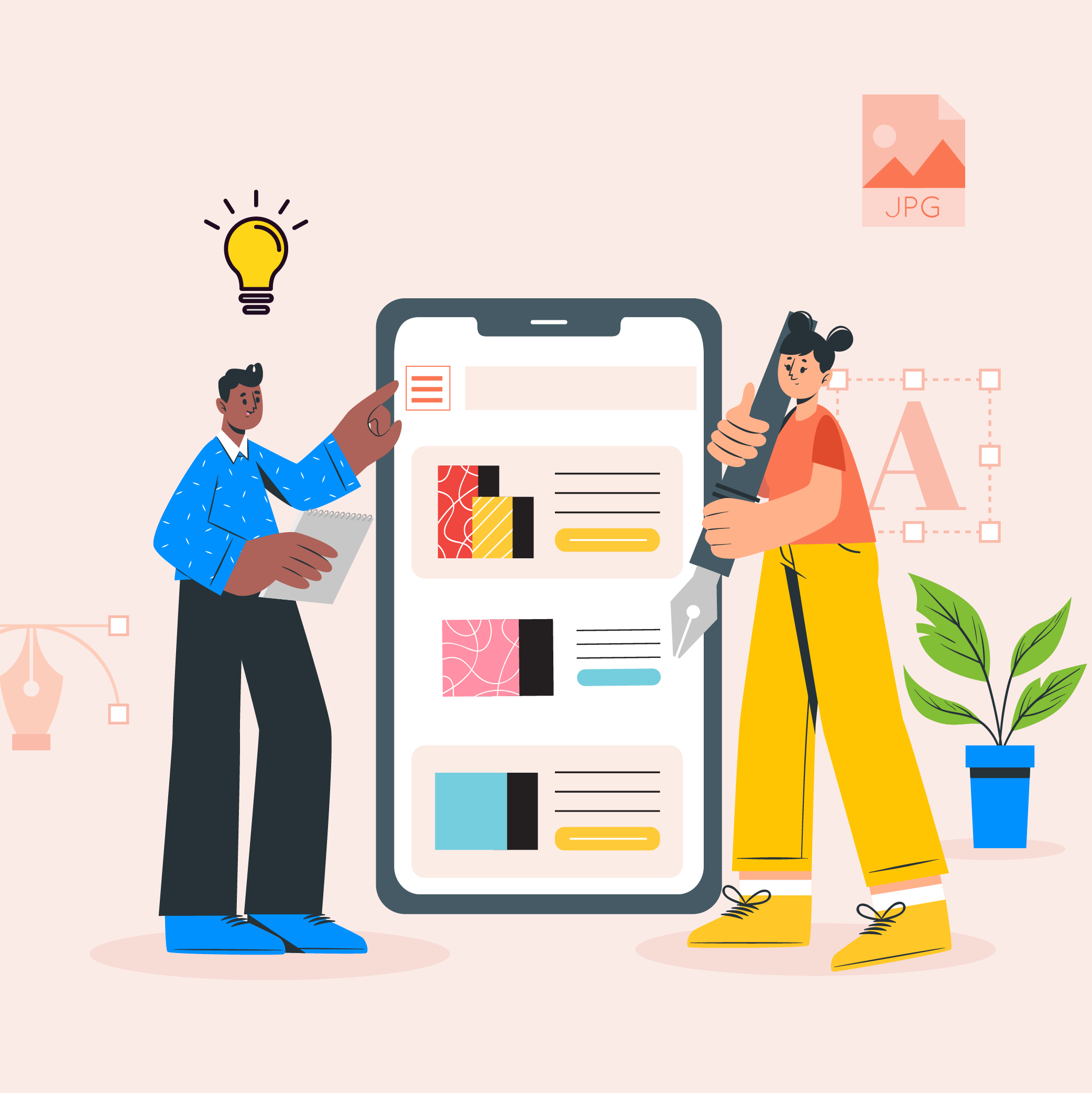
7. Choice of Icon
![]()
Icons, when chosen rightly, enhances the usability and the design of the app. Now, Material Design interface gives you the choice of a number of icons falling into two main criterias – Product Icons and System Icons.
8. Make the App Typographically Right

If you are just starting with the idea of developing a an Android Material Design App, what we recommend is that you should stick with Roboto and Noto typography styles.
9. Incorporate Responsiveness in your design

One of the main guiding principle that Material thrives on is consistency. And the same should be visible in your mobile app design.
Every one of your design elements should work the same across all the devices the user interacts with.
While these 9 inclusions would help you with your current apps, the designing standards are all set to get redefined again with new Material Design Version being prepared inside the Google creative lab workshop.
And now, it is time to look into the different apps revamped (or revamping) using Google’s Material Design.
Best Apps That Revamped their Design with Material Design Guidelines
1. Google Calendar
Google Calendar is the foremost application that has received really impressive changes over the years with the implementation of Google’s Material Design guidelines. The application has ample useful touches such as graphics and maps that are introduced to the events automatically and a simple auto-suggest system that brings ease to add a new appointment.
2. Gmail
Thanks to Material Design, emails in Google Gmail are categorized in a card-style interface. Also, a completely new slide-out menu is added to the interface along with a floating button for creating a new message, reminder or perform any other action.
3. Lyft
Lyft is another app that employs the power of Material Design. The app showcases a bunch of controls and a map displaying the required information by following Google’s material design principles without making the UI annoying.
4. BuzzFeed
Another mobile application that has made its mark among Google Material Design apps is BuzzFeed.
The application was earlier popular for its highly engaging entertaining content. But now, it is also known for setting a standard of how a Google material design web application should appear.
5. Google Maps
Last but not least, Google Maps is another application that is showing a major difference that embraces Material design. As per the recent news, Google Maps’ new design includes round and colored icons in the search section and a white background, which was earlier available in black and light grey color, respectively.

Here’s what’s next in line for Material Design –
What Next for Android Material Design?
After changing the designing world standard with the Google ux guidelines, Google has yet again brought in a change in its structure with Material Design 2.0.
The second generation of Material Design, which would be made live for the world in a few days, will bid adieu to the rectangular interface and move on with the rounded edges mobile user interface design.
With its new Android ux guidelines, Google is planning on giving a facelift to all its crucial products such as Gmail, Google Search, Google Maps, etc.
The goal of Material Design 2.0 – The Material Design Successor – is to increase efficiency, readability, and eliminate clutter – thus providing the cleanest implementation of a UI, till date.
Final Note
So here it was, the guide to Android Material Design for not just the Android App Designers but also for android app development companywhich has just stepped into the world of Android app designs.
Now whether you are a designer or a business looking to rule the million Android hearts, to prepare your app to join the list of the best Google material design apps, consult our team of Mobile UI/UX Designer, today.

- In just 2 mins you will get a response
- Your idea is 100% protected by our Non Disclosure Agreement.
11 Principles of UX Design From A Startup Perspective
When we hear the word design, we think of creativity or some creative role, in which an individual crafts and designs something beautiful. But, there is a thing with UX design that makes us understand that only aesthetically good designs won’t make for a usable interface. A good user designer makes great user research. When…
Intuitive Search Specs that Separate the Best from the Rest
Sometimes you hear people utter the phrase “I had an intuition” at which point you may wonder whether he/she has the ability to view the future. But that isn’t the case. Intuition is the feeling people derive based on instinct and this instinct isn’t based on conscious reasoning. This subliminal, cerebral concept holds immense significance…
15 Steps to Mobile App Redesign for Market Domination
App redesign is no joke. If you run a mobile-powered business then you are virtually on life-support while indulging in a UI UX overhaul. And if you do not realize that already, then there is all the more need for someone to point you in the right direction. We assume you want a word by…