


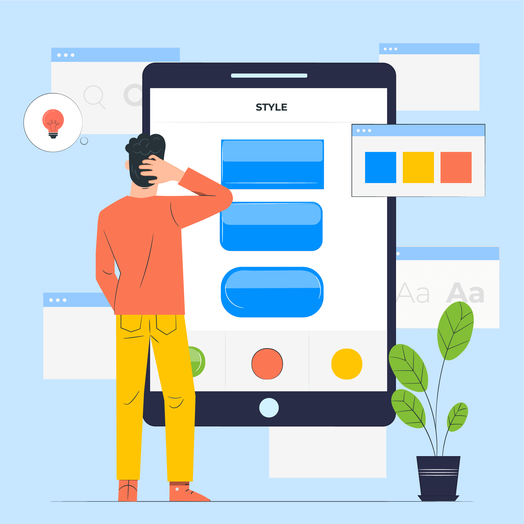
How to Design Dark Mode: A 2026 Guide for Mobile App Designers


Dim the lights, relax your eyes and save your energy. Dark mode is one of the biggest trends in mobile app design, and world-class brands like WhatsApp, Instagram, Google, Facebook and Apple have already jumped on the dark mode design train.
The official launch of Android 10 and iOS 13 brought Dark theme User Interface in the limelight. Both Apple and Google have dedicated their resources and attention to dark mode since the past few years.
If done correctly, the benefits of the dark mode are unprecedented. They can be read more easily in low light. They lower eye strain. They can highly eradicate battery consumption, based on the screen.
To get the Dark Theme ready for an app is becoming a mandate for every mobile app design company. Nonetheless, the dark mode app design challenges can’t be ignored. It’s not possible to simply reuse colours or invert the colours. You will obtain the polar opposite of what you require if you do so.
When dark mode is designed incorrectly, it causes eye strain and makes reading in low light more difficult. The low brightness of this theme creates a sense of security in a dark environment. As a result, when creating gloomy themes, make sure they’re enjoyable, balanced, and readable.
In this article, we are going to look into how mobile app designers can get started with delivering a dark mode UI design experience to their users.
How to Design a Dark Theme for an Android App?
Google comes with an extensive documentation support that helps designers get started with understanding how to design dark themes for Android app.
The tech giant has established four principles that defines the dark theme User Interface and gives a starting point for how to develop dark mode app design –
1. Grey vs black
The first thing you might notice is that the default background for apps in dark theme is not black, but instead a dark grey: #121212.
There’s lots of discussions about why we chose grey vs black, especially since the platform in Android 10 uses a black background. This is largely a trade-off between usability vs power savings.
Using a pure black #000000 color as the background in the platform, allows the system apps and surfaces to use as little power as possible when they’re open on OLED displays. These system surfaces tend to be quite simple, typically just text and simple icons, so to battle contrast issues we can adjust the text and icon colors to suit.
In apps though, your surfaces can contain anything: complex colorful vector animations, bright imagery, contrasting branded surfaces and lots more. Placing these against a pure black background means that the resulting contrast is much higher, which can increase eye strain. Hence using a light coloured or grey background is the solution.
2. Attention to detail in Color with accents
When defining a color scheme for a dark UI, Google recommends to apply limited color accents in dark theme UIs, so the majority of space is dedicated to dark surfaces. Also, keeping the dark background makes the photo visuals deeper and creates eye-pleasing contrast with the accent color. Using split complementary colors can help. The scheme has one dominant color and two colors adjacent to the dominant color’s complement. Doing this provides the needed contrast without the tension of the complementary color scheme.
3. Conserve the Battery Life
Dark themes reduce the luminance emitted by device screens, while still meeting minimum color contrast ratios. They help improve visual ergonomics by reducing eye strain, adjusting brightness to current lighting conditions, and facilitating screen use in dark environments – all while conserving battery power. Devices with OLED screens benefit from the ability to turn off black pixels at any time of day or by reducing the use of light pixels.
4. Choosing accessibility compliant color combinations
Accommodate regular dark theme users (such as those with low vision), by meeting accessibility color contrast standards.
There are different properties they have fixed in the Google Material Design Guidelines for Dark color scheme and overall mode –
Elevation: In the process of designing dark theme, the components retain the same default shadow components and elevation levels as in case of the light theme. What differs is the illumination of the surface of elevation levels.
The higher a surface elevation, the lighter would be the surface. The lightness is shown through a semi-transparent overlays’ application. Overlays also make it possible to differentiate between the components and see the shadows.

Accessibility & contrast: The background in dark theme UI design should be dark enough to show white text. They must use a contrast of a minimum of 15.8:1 between the background and text. Doin this ensures that the body text passes the WCAG’s AA standard of 4.5:5:1 when added to surfaces at highest elevation.

Colors: Designers should focus on using desaturated colors for they increase legibility. The choice of primary and secondary colors must also depend upon the consideration of both light and dark UI themes.

Light text on dark backgrounds: When a light text comes on dark background, it must use these opacity levels:
- High-emphasis text has an opacity of 87%
- Medium-emphasis text and hint text have opacities of 60%
- Disabled text has an opacity of 38%

States: States communicate the status of interactive elements for dark theme layouts or components by using the overlays. In dark theme, states must use the same overlay values as the default light theme. There are two containers which inherit the state overlays: Surface and Primary.
Surface containers which use the Surface color must apply an overlay which matches the color of text or icon. For the surface containers which use the Primary color, the state overlay must be white.
How to Design an App for iOS in Dark Mode?
With dark mode, Apple has revisited the meaning of UI styling and colors in iOS. Let’s look into the changes that Apple has brought to help you with designing for dark mode on iOS 13. 💡
Semantic colors
Apple has introduced semantic colours for commonly used UI components to balance the feel and appearance of iOS apps in both light and dark mode. These colours do not have the best RGB value; instead, they change the iOS interface style directly. Furthermore, in dark mode, these semantic hues aid in dealing with the overlay colour and text.

System colors
Apple has brought nine predefined system colors that are supportive of dark system-wide appearance and dynamic. Hence, these colors modify to chosen interface styles.

Vibrancy and Blur Effects
With iOS 13, Apple has introduced 4 blur effects and 8 vibrancy effects, which automatically adapts to the iOS interface style.
Here are the blur effects in the dark and light mode:

Apple has also introduced 4 vibrancy effects in iOS dark mode typography suite, 3 in overlay and 1 for separator. Here they are:

SF Symbols
Apple, in their Human Interface Guidelines, offers a collection of more than 1500 symbols for Product designers to use in their applications. They automatically look amazing in the Dark Mode for they have been optimized for both light and dark UI.
Tips for Effective Mobile App Dark Theme Design
Dark mode is one of the most requested features over the past few years. Both Apple and Google made the dark theme an essential part of the UI. Dark mode’s reduced luminance provides safety in dark environments and can minimize eye strain.
There are certain processes that need to work properly when creating dark mode UI. After all, you want your product to be amazing, right? Let’s check off all the boxes for a best practices checklist on how to design a dark mode for your app.
1. Avoid the pure black color
A dark theme must not be of white text on black background. In fact, it can be difficult to look into a high contrast screen.
When you add dark mode to your app, it is safest to use dark grey as the primary color for the dark mode components, as it lowers the eye strain and also it is a lot easier to look at shadows on a grey surface compared to black.
2. Avoid the use of saturated colors on the dark themes
The saturated colors that look great on the light surfaces can vibrate against the dark background, making the text extremely difficult to read.
You should use light tones for they have better readability and they don’t make the UI unnecessarily expressive, which saves unnecessary eye strain.
3. Consider the emotional side of your app design
When you design a dark theme for your app, chances are that you must be aiming for translating the same emotional feel of your light theme design in the dark theme as well.
But it is unwise to do so. Because, ultimately different colors project different emotions. As a result, your dark mode colors will evoke a different feeling. This is why it is necessary to find a common ground emotional set for both your theme UIs.
4. Test the design in both the appearances
Just like how your users would toggle between both the theme UIs at different times of the day, it is necessary to test the app two times of the day to see how it is functioning in different light conditions. And to ensure it meets your criteria.
5. Incorporate dark mode into animations and illustrations
If your app contains animations or heavy graphical elements, you will have to prepare for their adoption in dark theme as well. In case the illustration contains a subject and a background, it would be good to fully desaturate the background colors to help keep the attention on the subject.
6. Meet accessibility color contrast standards
Ensure that your content remains comfortably legible in Dark Mode. Dark theme surfaces must be dark enough to display white text. Google Material Design recommends using a contrast level of at least 15.8:1 between text and the background. Use color contrast tools to test contrast ratio.
7. Don’t just reverse
If you’re transitioning from standard to dark mode, the original theme may provide useful visual signals. To create a dark theme, don’t simply flip the colours. You could be transforming colours with psychological significance into meaningless bland tones. Make a conscious decision regarding the colours you use.
8. Use the right “on” colors
‘On’ colors are found on top of key surfaces and elements. Usually, they are used for text. For a dark theme, the default ‘on’ color is pure white. But it’s a bright color and would vibrate visually against dark backgrounds. For this reason, Google Material Design suggests using a little darker white.
- Disabled text utilizes darkness of 38%.
- At 60%, medium-emphasis text is executed.
- High-emphasis text must have the darkness of 87%.
9. Get deep
The higher a layer is, the lighter it should be. This will create a visual hierarchy in dark mode that goes from the most used elements in your display to the least.
With this, you now know everything there’s to know about designing the dark mode version of your app. The next actionable step is to talk to a team of experts who have implemented the UI in applications. You should see this as a way of getting closer to achieving your intent to offer a healthy experience to your end users.
Wrapping Up
With this, you now know everything there’s to know about designing the dark mode version of your app. The dark mode app design is a revolution that is just getting fired up. That means it’s the perfect time to go dark and get creative. The next actionable step is to talk to a team of UI experts who have implemented the UI in applications and get a real view of the importance of UI design in app development. You should see this as a way of getting closer to achieving your intent to offer a healthy experience to your end users.
Want to learn more about dark mode app design? Get in touch with the experts in app development.

FAQs About Designing Dark Mode App
1. Is Dark mode better for the eye?
Yes. The dark mode app design prevents instances of tiring and drying of eyes with prolonged mobile phone usage. By not being contrasting, it becomes easier for users to scroll through the application in the dark.
2. How do you design for dark mode?
While both Apple and Google have their documentation explaining the process of designing a dark theme application, there are some tips that must be considered. Some of them are: avoid solid black colour, keep the emotional aspect of using black colour in mind, look at the transitional difference between white and dark mode app design.
3. Is there anything as unhealthy dark mode?
Yes, there are instances where dark mode can do more harm than good. They can cause hazing effect or when not enough attention is paid to the contrast style, they can strain the eyes to a huge extent.

- In just 2 mins you will get a response
- Your idea is 100% protected by our Non Disclosure Agreement.
11 Principles of UX Design From A Startup Perspective
When we hear the word design, we think of creativity or some creative role, in which an individual crafts and designs something beautiful. But, there is a thing with UX design that makes us understand that only aesthetically good designs won’t make for a usable interface. A good user designer makes great user research. When…

Intuitive Search Specs that Separate the Best from the Rest
Sometimes you hear people utter the phrase “I had an intuition” at which point you may wonder whether he/she has the ability to view the future. But that isn’t the case. Intuition is the feeling people derive based on instinct and this instinct isn’t based on conscious reasoning. This subliminal, cerebral concept holds immense significance…

15 Steps to Mobile App Redesign for Market Domination
App redesign is no joke. If you run a mobile-powered business then you are virtually on life-support while indulging in a UI UX overhaul. And if you do not realize that already, then there is all the more need for someone to point you in the right direction. We assume you want a word by…


